Mobile & iPad Terminal
Phone and tablet workflows designed as real trading surfaces, not squeezed desktop pages.
Omni Terminal treats mobile and iPad as first-class terminal surfaces. The phone layout uses dedicated route shells, bottom navigation, drawer screens, chart and advanced trade modes, and touch-safe controls; iPad keeps tablet workflows usable without breaking chart, ticket, private tabs, or docs navigation.
At a glance
- Phone shell
- Bottom nav + drawers Mobile routes expose Home, Trade, Alpha, Assets, and Docs surfaces with touch-friendly navigation.
- Trade modes
- Chart + Advanced Chart view keeps chart, ticket, summary, account, and private tabs in flow; Advanced collapses chart and pairs ticket with orderbook.
- Tablet
- iPad checked iPad projects verify private panes, alpha views, docs routes, and lower-panel usability.
Why It Matters
What traders and researchers should take away
- Mobile trading fails when a desktop terminal is merely shrunk; Omni keeps the key trade flow in a deliberate vertical order.
- Phone controls need predictable 44px-class targets, safe-area handling, and non-sticky submit flow so users can review before acting.
- iPad users need enough density to trade and inspect data without losing the lower private panes or docs navigation.
How it works
What the product uses behind the scenes
- Mobile layout rules document chart/advanced trade ordering, bottom nav, drawer behavior, and safe-area constraints.
- The mobile parity matrix documents which terminal surfaces are covered and which routes are verified.
- Playwright mobile and iPad specs assert route rendering, bottom navigation, account drawers, alpha/liquidation views, and docs accessibility.
Notes
Things to know
- Mobile layout docs are product behavior, not trading advice.
- Phone screenshots should avoid live private balances and wallet-specific state.
- Docs navigation on small screens uses a drawer; iPad landscape keeps the left navigation while hiding the right TOC earlier to protect reading width.
Screenshots
Real UI references
These are captured from Omni Terminal routes with public-safe state. Private balances, wallet secrets, access headers, and live private positions are not used.
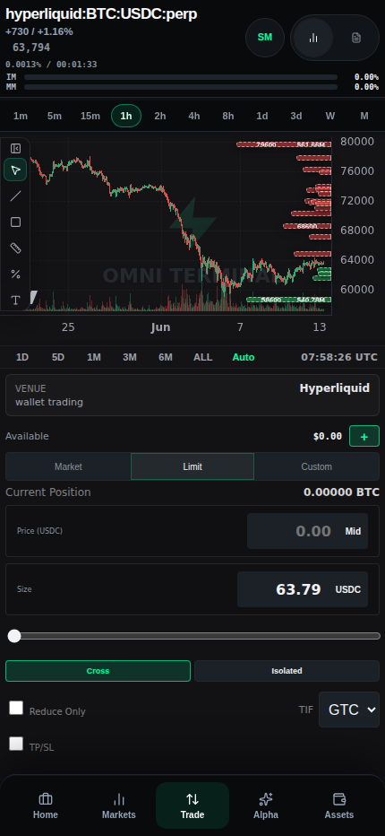
/terminal?symbol=BTC on iPhone viewport 2026-06-13 - docs-v1
/docs/mobile-and-ipad-terminal on iPad viewport 2026-06-13 - docs-v1Chart mode
Chart mode preserves the normal trading flow as a vertical stack for phone screens.
- The expected order is chart, ticket, trade summary, account summary, and private tabs.
- Buy/Sell and Place Order stay in the normal ticket flow rather than becoming fixed or sticky controls.
- Funding and risk context remain visible near the ticket so the user can review before submitting.
Advanced mode
Advanced mode prioritizes dense execution controls while preserving access to chart and private state.
- The chart can collapse so ticket and orderbook can sit together in a denser execution layout.
- Private tabs remain below the execution columns instead of disappearing behind navigation.
- Touch targets for chart/advanced controls stay large enough for phone use.
iPad behavior
Tablet layout needs more density than phone, but still cannot assume full desktop width.
- iPad landscape can keep the left docs sidebar while hiding the right on-page TOC to preserve article width.
- Tablet terminal tests keep lower private panes usable and verify alpha/liquidation surfaces.
- The docs shell uses the same canonical content on
/docs/*and/terminal/docs/*with mobile drawer behavior only below the narrow breakpoint.
Verification
Mobile and iPad behavior is backed by specific local docs and Playwright coverage rather than visual preference alone.
- Use
HL_MOBILE_PARITY_MATRIX.mdfor coverage expectations and route parity. - Use
.cursor/rules/mobile-terminal-layout.mdcfor the layout invariants that should not be broken casually. - Use
mobile-terminal.spec.tsandtablet-terminal.spec.tsfor smoke and regression coverage.
References
Implementation references
Mobile parity matrix
omni-terminal/docs/HL_MOBILE_PARITY_MATRIX.mdDocuments mobile route coverage, phone trade layout expectations, and parity status.
Mobile terminal layout rules
omni-terminal/.cursor/rules/mobile-terminal-layout.mdcDefines chart/advanced ordering, touch targets, bottom nav, drawer, and safe-area constraints.
Mobile terminal Playwright coverage
omni-terminal/tests/e2e/mobile-terminal.spec.tsCovers mobile route rendering, bottom nav, alpha/liquidation views, wallet/account flows, and phone trade controls.
Tablet terminal Playwright coverage
omni-terminal/tests/e2e/tablet-terminal.spec.tsCovers iPad Pro lower private pane and alpha route usability.